Do you remember a few years ago, when everything looked terrible on mobile devices and that was kind of just the accepted reality of things? Obviously that’s no longer the case. Today, web sites need to look great on both the desktop and mobile devices because most of your typical audience is just as likely to be checking out your site from their iPad, as they are from their desktop computer at the office. The ability of a site to display well across all types of devices is called responsive design. Put differently, its web design that responds and optimizes site appearance and navigation so that the site looks good on whatever device it’s being displayed on… meaning, the site looks good on a computer, on a tablet, or a phone. It doesn’t matter what you view it on, because the design responds to the environment that it’s being used on.
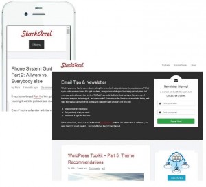 As an example, here’s a comparison of what this site looks like when viewed from iPhone vs. Chrome on a desktop. The responsive design enables the content to display in a useful manner on a mobile device. Put differently, responsive design is about creating a user-friendly site experience, making the site more appealing, and creating a great user-experience across many devices and screen sizes. While you can build a responsive design yourself, or contract a company to do this for you, in most cases finding the right theme that’s already responsive is often the best approach. In the prior article in this series, I mentioned several themes which were responsive and useful.
Is responsive really design for me?
The answer is almost certainly yes. Here’s why… even if you expect that the vast majority of your site’s visitors will be coming in via a desktop web-browser, the reality today is that your site is going to rank better in terms of Search Engine Optimization (SEO) if you have a responsive design that works well with mobile devices. In other words, Google loves responsive web design and your search results will rank higher automatically just by choosing a responsive theme. If for no other reason, that’s why you should consider a responsive theme. Beyond that, one of the added benefits of responsive design is less management effort. In the majority of cases, one you have a responsive site, there’s no longer a reason to do both a mobile and desktop version of your site. That means no separate content management tools, or sites to maintain, or having to worry about separate URLs, and building the authority and rank of each site independently. Which makes sharing content on social media that much easier – both for you, and your audience. All of that extra stuff (and cost) just goes away.
Okay, so say none of this is you… maybe you don’t think you really care about responsive design, and maybe you just think of your web-site as a “me too”, or “must have” – a placeholder for your business. That’s fair… many companies, niche companies, and organizations that have very complex or products just have a site because they have to. But even if all of that’s true of your business – why wouldn’t you want your site to look good on a tablet? Why wouldn’t you want to automatically improve your page rank? Why wouldn’t you want want a new potential avenue for clients? If you’re going to be making any investments in a site, choose a responsive theme.